

Every SENAITE user spends most of their day inside a listing.
Samples, worksheets, batches, invoices. The listings look plain
because they must: the density of information is the feature.
Which makes small ergonomic wins compound quickly. This half,
senaite.app.listing shipped several.
Saved filter presets
#174 adds a bookmark pill next to the search box. Set up your view (review state, column filters, sort, page size, search term), click the pill, save it as “Overdue serology” or “This week’s water samples”. Reopen the listing on Monday and the preset is one click away.
The storage key uses the listing’s listing_identifier (a
server-computed value the column-config feature already used),
with form_id as fallback. That matters when the same form_id
is reused across contexts: your per-client “samples” listing and
the global “samples” listing do not share presets by accident.
Each preset captures review_state, column_filters, sort_on,
sort_order, pagesize, and filter. Rename, delete, and save
happen via inline editors (no more window.prompt), each
accepting Enter to confirm and Esc to cancel. When your live
view diverges from the stored payload, the preset gains a
“modified” tag with inline save and undo actions. Pick a
default and it auto-applies on landing when no URL parameters are
present.
The same PR fixed a subtler bug: column-filter dropdowns used to
show every possible value for a column, ignoring whatever other
filters were already active. You could pick a value and land on
an empty table because two of your filters cannot coexist. The
new apply_column_filters(query, exclude=None) signature narrows
each dropdown by every other filter in force, so what you see is
what you can pick.
Label chips, click-to-filter
Companion to senaite.core#2958,
#178
renders sample labels as coloured chips under the primary column.
Click a chip, the URL gains ?labels=<name>, the listing filters.
Click a second chip, both filter. Click the same one again, it
clears. An active-filter row above the search box shows every
?labels= value with an X to remove it.
The Reset button (the small spinning arrow) now also wipes
?labels=. Saved presets capture and re-apply label state via a
navigation, so a bookmarked share-link with ?labels= does not
get overridden by an auto-applied user default.
Removable filter chips in the toolbar
Column filters were only visible as a highlighted funnel icon on
the header. If you set three filters and forgot two of them, you
saw an empty table and had to hunt the funnels.
#180
renders each active column filter as a <column>: <value> ×
chip in the toolbar. Click the X, that filter clears, the
listing refetches, everything else stays put. It is generic, so
any listing with column filters gets it for free.

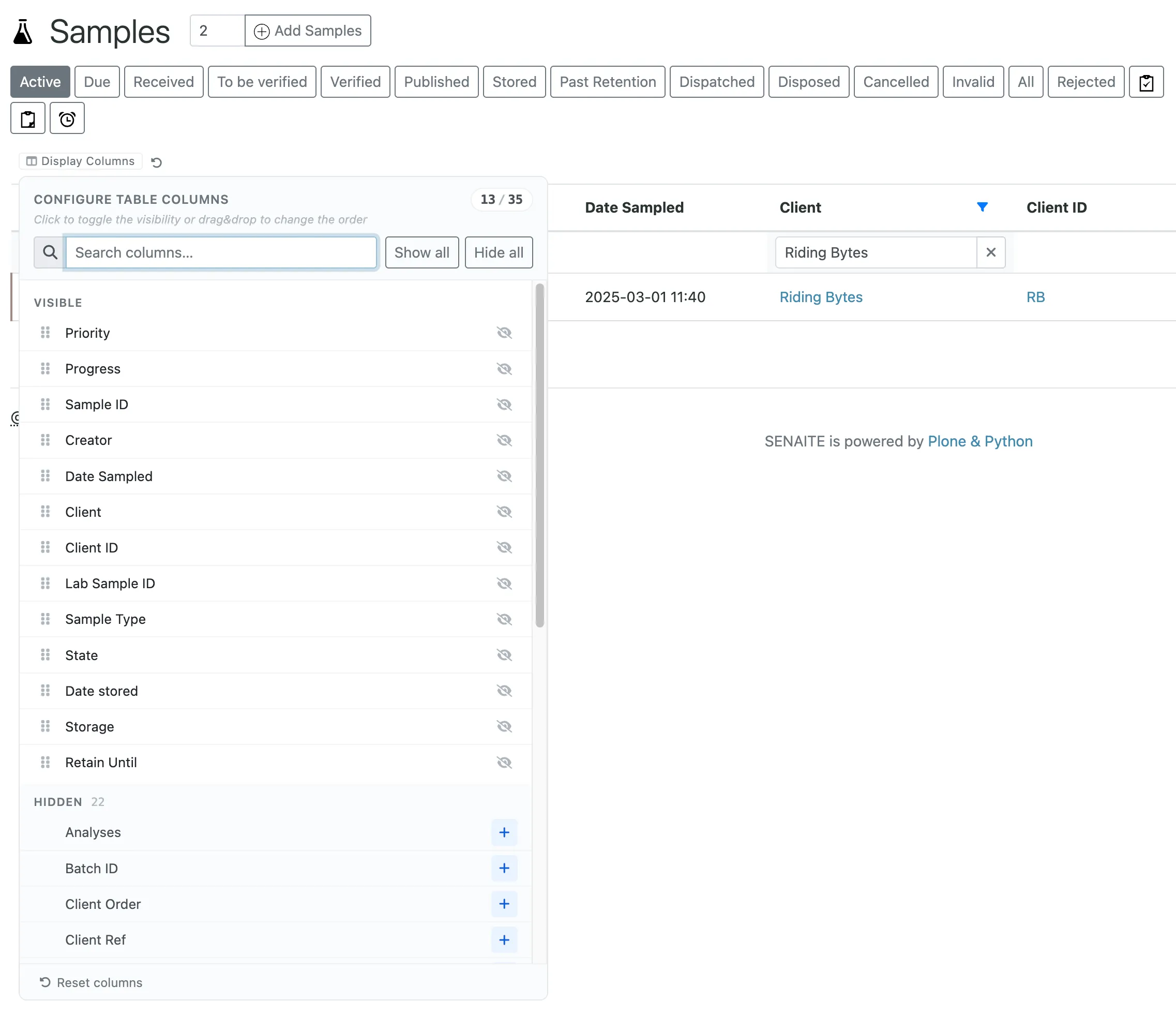
Column config as a searchable popover
Thirty columns in a horizontal chip row was legacy pain.
#176
replaces it with a small [⊟ Configure] button that opens a
structured popover: search input at the top with autofocus, Show
all / Hide all bulk actions, a Visible section (drag handles on
the left, eye-slash to hide on the right) and a Hidden section
(alphabetised, + restores at the end of Visible).
The drop indicator is a 2 px accent line above or below the
targeted row, computed from cursor Y within the row. No more
guessing where a column will land. The popover renders via
ReactDOM.createPortal to document.body, escapes the
table-responsive overflow-x: auto, follows the trigger on
scroll and resize, and closes on outside click or Esc.
Under the hood, the whole colour palette moved to --sf-*,
--listing-*, and --listing-bs-* tokens in a single :root
block. Add-ons that want a theme can override those tokens
without rebuilding the bundle. A future [data-theme] selector
can re-skin at runtime.
Smaller wins worth naming
#179 made KeywordIndex column filters populate their autocomplete from the actual indexed values and AND multiple selections instead of OR-ing them. If you pick “Ca” and “Mg” in an analysis-keyword filter, you now get rows that have both, not either.