

The dashboard is the page SENAITE opens after login, at
/senaite-dashboard. The SENAITE logo in the top left brings you
back to it from anywhere. It answers two questions: what is
waiting for someone right now, and how has the work developed
over the last weeks or months.
This post describes the rebuilt dashboard that ships with SENAITE 2.7. At the time of writing 2.7 is on the development branch and not yet released. Installations on 2.6 have the older dashboard, which shows the same three statistics panels in a different layout.
Three tiers, three audiences
The page is built top to bottom in three tiers.
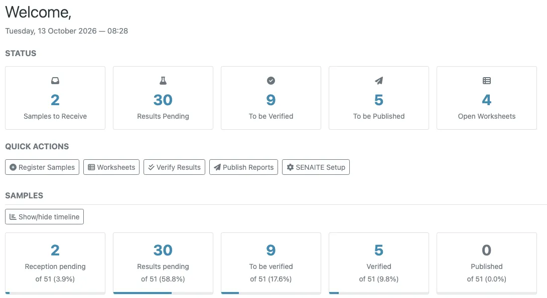
Status cards. Five counters for work waiting to be done: Samples to Receive, Results Pending, To be Verified, To be Published and Open Worksheets. Each card is tied to a permission. Samples to Receive needs the permission to receive samples, To be Verified the permission to verify, To be Published the permission to publish, Open Worksheets the permission to edit results. A user only sees cards for work they are allowed to do.
Quick actions. Register Samples, Worksheets, Verify Results, Publish Reports and SENAITE Setup. Same principle: each link is shown only to users who hold the matching permission.
Statistics panels. Samples, Analyses and Worksheets, each
with one card per workflow state and a timeline chart. This tier
sits behind a permission of its own, senaite.core: View Dashboard, which the default role map grants to Lab Clerk, Lab
Manager and Manager.
That last point catches labs out in workshops. An analyst logs in and sees the greeting, the cards and the quick links, but no statistics. Nothing is broken; the Analyst role simply does not hold View Dashboard. If your analysts should see the panels, add the permission to their role. Client contacts never see the dashboard at all: they are redirected to their own client page.
What the cards count
Every card shows a count, the share of the total and a thin bar with the same proportion. A click opens the matching listing, already filtered to that state.
The samples panel shows Reception pending (sample_due), Results
pending (sample_received), To be verified, Verified and
Published. Two settings add cards:
- With the sampling workflow enabled, To be sampled, To be preserved and Sampling scheduled appear in front.
- With the printing workflow enabled, a To be printed card counts published samples whose report has not been printed yet.
The analyses panel shows Unassigned, Assigned, To be verified, Verified and Published. Unassigned and Assigned refer to worksheets: an unassigned analysis is not on any worksheet yet. The worksheets panel shows Results pending (open worksheets), To be verified and Verified.
All counts cover active objects only. Cancelled and deactivated items do not appear, and the percentages are shares of the active total.
Reading the timeline correctly
Each panel has a Show/hide timeline button. It folds out a stacked bar chart, and the choice is remembered in a cookie, so a chart you opened stays open on your next visit.
Above the chart you pick the period: Daily, Weekly, Monthly, Quarterly, Biannual or Yearly. The period sets both the width of one bar and how far back the chart reaches. Daily covers the last 30 days, Weekly about six months, Yearly about sixteen years.
The detail that matters: each bar counts the objects created in that period, coloured by the state they are in today. The chart is not a history of how many samples were waiting for verification last March. It shows what became of the samples registered in each period.
That changes how you read it. A worked example with a weekly chart:
- The bar for the current week is mostly Reception pending and Results pending. That is normal: the samples just arrived.
- The bar from four weeks ago is mostly green (Published) with a thin band of To be verified. Those are samples registered a month ago whose results nobody has verified yet. That band is the one to follow up.
- A bar from three months ago that still shows Results pending points to samples that were registered and never processed. Often they are duplicates or samples that never arrived, and they should be cancelled or rejected rather than left open.
Recent bars are allowed to be colourful. Old bars should be uniformly green, and anything else in an old bar is work that got stuck.
Why the numbers can lag
The page itself renders without touching the database. Every
card group and every chart is fetched afterwards from a JSON
endpoint, @@senaite-dashboard-data, one request per section, so
a slow section does not hold up the others.
Both are cached in memory and shared across users. Counts are kept for five minutes. Chart data is kept for two hours, which the chart header states (“updated every 2 hours”), because building it means walking every object in the period.
So a sample you verified a minute ago may still be counted under To be verified. If the dashboard and a listing disagree, the listing is right, because it queries live. The cache lives in the server process, so a restart clears it.
Where the dashboard stops
The dashboard counts by state and by creation date. It does not show turnaround times, late analyses or per-client figures. For late work the samples listing has its own quick filter. For recurring extracts with custom columns, a Databox is the better tool. And when you open the listing behind a card with the same combination of filters every day, store it as a saved filter instead of rebuilding it each morning.
Before you roll it out
Decide three things with the lab team:
- Who should see the statistics. By default analysts do not.
- Whether the sampling or printing workflow is on, since both add cards that will otherwise surprise people.
- Which period the team looks at in the weekly meeting. Weekly bars over six months suit most labs. Small labs get more from Monthly, where single bars are not mostly empty.